The range of techniques to analyze trends and minimize noise in time-series is quite extensive.
Fixed Period Aggregation
One of the most common approaches is to regularize time-series by applying a grouping function to observations made within each fixed-duration period. This transformation is called aggregation and we can apply it to raw series to calculate, for example, hourly averages from irregular samples. Each period in the above example would start at exactly 0 minutes and 0 seconds each hour and have a duration of 60 minutes. The period would include all values that occurred between HH:00:00.000 and HH:59:59.999. The most commonly used functions include:
- Sum
- Minimum
- Maximum
- Median
- Average / Mean
- Percentile (0 to 100%)
- Standard Deviation
- Variance
In relational databases aggregation for specific periods such as 1 minute, 1 hour, 1 day, 1 month, 1 year can be easily computed with GROUP BY function by formatting timestamp with a truncated datetime pattern. Any other period is more difficult to implement and the query often involves database-specific syntax and nested queries.
SELECT server, AVG(cpu_busy), TO_CHAR(sample_time, 'YYYY-MM-DD HH24') FROM metrics_os_intraday GROUP BY server, TO_CHAR(sample_time, 'YYYY-MM-DD HH24') |
On the other hand, non-relational time-series databases are built with support for custom aggregation periods and allow the user to easily specify any period. In ATSD the period is specified with interval = [count] [unit] format, for example: interval = 15 minute. The aggregation period can be also customized interactively using aggregation controls in time-series chart.
List of aggregators supported in ATSD API:
- COUNT
- MIN
- MAX
- AVG
- SUM
- PERCENTILE
- STANDARD_DEVIATION
- FIRST
- LAST
- DELTA
- WAVG
- WTAVG
- THRESHOLD_COUNT
- THRESHOLD_DURATION
- THRESHOLD_PERCENT
Sliding Window Aggregation
Sliding window aggregation is closely related to moving average which is another widely used method to smooth effects of individual observations and to display trends behind raw data. Such an average is computed for the last-N samples or for samples taken during the last-N minutes.
In both cases, the calculation relies on the concept of a count-based on time-based sliding window which boundaries are continuously adjusted as we progress along the timeline.
| Window Type | Example | Description |
|---|---|---|
| count | average(100) | Average value of the last 100 samples. |
| time | average(’15 minute’) | Average value of all samples collected during the last 15 minutes. |
There are different types of moving averages with better control over smoothing with linear, geometric or exponentially decreasing weights (see Wikipedia) but we won’t go into their detailed descriptions in this article. Likewise, it is possible to utilize any grouping function such as percentile(95%) instead of average.
In terms of visualization, moving averages are often displayed alongside raw values and the chart may include multiple moving averages for different time intervals. This is especially common in technical analysis used in finance and econometrics.
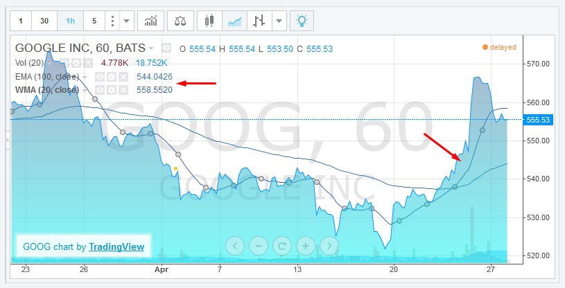
Source: Trading View
The product of sliding window aggregation is not the same as periodic aggregation however. Moving average series contains the same timestamps as the underlying raw series which means that such series could be irregular and may contain an arbitrarily large number of samples.
Combined Aggregation
What we’re interested are scenarios when it’s beneficial to combine periodic and sliding aggregates in one representation.
Consider the case of CPU utilization where we need to display hourly CPU averages over the last 24 hours and also display values for the current hour since the data is streaming in continuously. We noticed that if we simply compute periodic aggregations, the average for the last (current) hour would become quite volatile at the beginning of each hour because the grouping function would be computed only for the first few samples. As result, end-users would get false-alarmed about sudden changes in monitored metrics at the start of the hour.
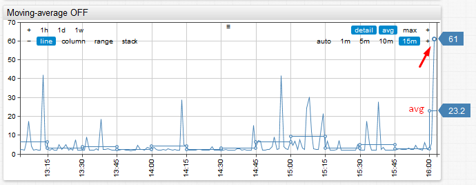
Consider the above example. Notice how average for the last hour spikes from 5% to 23% and back within a matter of several minutes. This could raise false-positive alerts particularly if the underlying metric is collected at a high-frequency and exhibits significant variance.
The solution we came up with was to implement a ‘moving-average’ setting which controls how the aggregate for the most recent period is calculated. If moving-average is enabled, the last period is computed as a sliding window. The end of the sliding window is equal to last sample time, and the length of the window equals aggregation period. This allows us to smooth aggregate values displayed at the beginning of the period.
This setting has proven to be quite useful and it’s now enabled by default.
See detailed example in our Chart Lab
