Creating a Custom Report With ATSD and Charts

Contents
- Overview
- Requirements
- Data Collection
- Data Modification
- Visualization Configuration
- Report Distribution
- Additional Examples
- Additional Resources
Overview
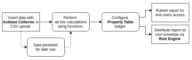
Use ATSD to create summary reports for time series data. Collect data from one or more sources, perform ad hoc calculations which do not modify the underlying data, and present the information in tabular format with minimal time requirements. Upon report completion, update data and distribute the report to subscribers on a schedule via Rule Engine.
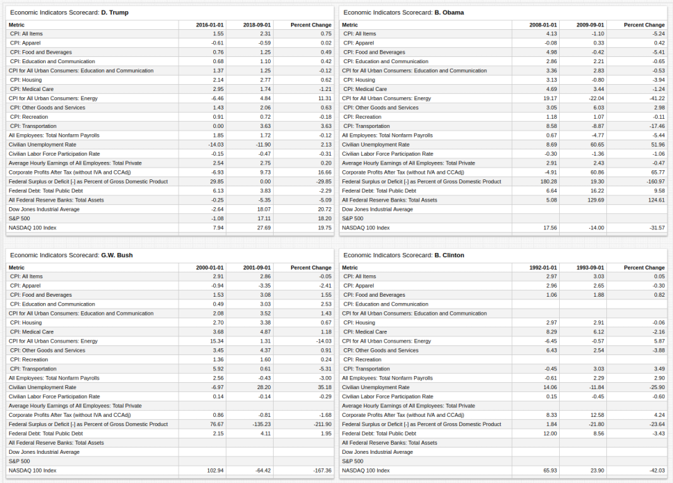
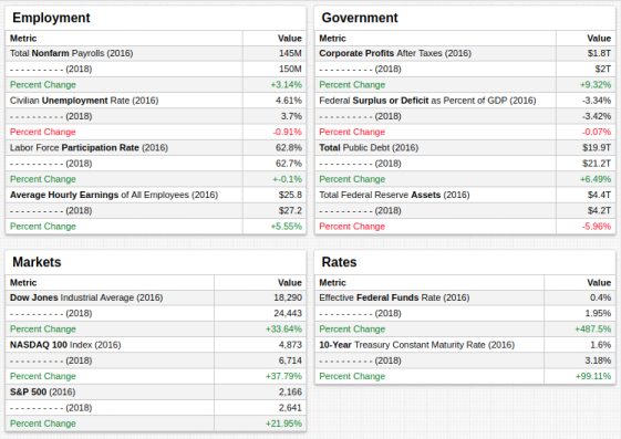
This tutorial demonstrates the creation of an economic indicators report in the Trends instance of ATSD for the previous four US presidents using macroeconomic metrics such as inflation and stock market value, as well as microeconomic metrics such as unemployment and average hourly earnings. The final result displays statistics for each metric in the month before a particular president has assumed office and again after they have served for some time.
Although dependant on the amount of underlying data, the complexity of the calculations involved, and the method of collection and insertion, the fundamental process of assembly and publication takes about ten minutes.
Requirements
Optionally, launch the ATSD sandbox Docker Image which contains ATSD, Collector, companion tools, and two-week trial license.
Data Collection
ATSD provides a number of ways to insert data:
Refer to the documentation above for specific instructions about each method of data insertion or read the Getting Started: Inserting Data tutorial.
Data Modification
Charts is a graphics library for visualizing time series data with widgets. This tutorial demonstrates report creation using the Property Table, which displays properties collected by an entity in tabular format.
The report compares metric value year-on-year percent change on 1 January after a president is elected to year-on-year percent change on 1 September after a president has served almost nine months and then calculates the difference between each value for each metric for each president.
These calculations require user-defined functions, a Charts feature whereby particular mathematical formulae not included in the Charts value functions library are uploaded to a local ATSD server in JavaScript form and invoked within a Charts application to be used for a particular visualization. Additionally, the Federal Reserve provides metadata which is uploaded along with series values. Rows are labeled with human-readable names (CPI: All Items) instead of their identification code in the FRED database (CPIEALL) with the underlying metadata.
[configuration]
import fred = fred.js
add meta = true
Value Calculation
The user-defined function configuration file fred.js includes the PercentChangeFromYearAgo function which is used to calculate each year-on-year change value.
[column]
series-value = fred.PercentChangeFromYearAgo(config().alias, '@{term.baseDate}')
The series-value setting contains placeholder syntax @{}; Charts iterates over a list of presidents and dates then inserts this value at each row in the finished table. The config() function returns a particular object from the application configuration, in this case, the alias for each series.
csv terms = name,baseDate,currDate
  D. Trump,2016-01-01,2018-09-01
  B. Obama,2008-01-01,2009-09-01
  G.W. Bush,2000-01-01,2001-09-01
  B. Clinton,1992-01-01,1993-09-01
endcsv
With control structures, define lists and loops, such as the one shown above. The column baseDate is used in the placeholder @{term.basedate} where term is a separate variable defined in the configuration.
for term in terms

  [widget]
    title = Economic Indicators Scorecard: @{term.name}
    type = table

for m in metrics
   [series]
    metric = @{m}
    alias = @{m}

endfor
endfor
The first for loop extracts information from the CSV list terms shown above and replaces placeholders containing the term argument. The second for loop iterates across the list metrics and creates a new [series] for each object.
list metrics = cpieall, cpieapparel,
  cpiebev, cpiecomedu, cpiedusl,
  cpiehouse, cpiemedcare, cpiengsl,
  cpieotrgs, cpierec, cpietrans,
  payems, unrate, civpart, ces0500000003,
  cp, fyfsgda188s, gfdebtn, walcl, djia,
  sp500, nasdaq100,
endlist
Metadata Labeling
Charts applications support JavaScript in the Editor window. The leading column identifies each metric by the underlying metadata label and the JavaScript string replace() function updates this value for each metric.
[column]
  series-value = replace(replace(meta().metric.label, 'Experimental', ''), 'Consumer Price Index', 'CPI')
Visualization Configuration
Charts documentation contains a complete list of additional settings not demonstrated in this tutorial.
Format the widget header with the header-style setting at the [configuration] level for the changes to apply to the entire portal, or at the [widget] level to affect only specific widgets in visualization. This setting supports CSS style syntax.
header-style = background: white;display: flex;align-items: stretch;padding: 4px;width: auto;
Define portal parameters using the height-units and width-units settings. Enable automatic text size formatting with the responsive setting.
[configuration]
  height-units = 2
  width-units = 3
  responsive = true
When a portal does not require an entire window, modify its location with offset settings to specify where the portal is displayed.
[configuration]
  offset-left = 400
Report Distribution
Upon portal completion, the report can be published within ATSD for both internal or external access. Refer to User Authentication documentation for specific instructions to expose a portal to non-authenticated visitors.
Use Rule Engine actions to specify behavior upon automated report creation following data update. For example, attach portals such as the report demonstrated in this tutorial.
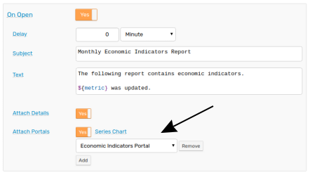
Automate data collection and update with the FRED Data Crawler or a JSON Job and set a rule which is triggered each time new data is inserted.

To deploy this rule in a local ATSD instance, download the template from the /resources directory and add legitimate metric and subscriber information.
For a detailed tutorial on the design and deployment of a custom reporting rule, refer to the GitHub Pull Request Report and Rule Engine documentation.
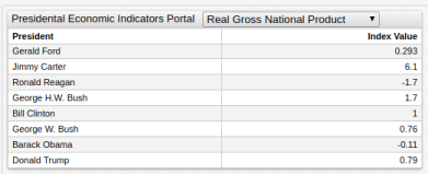
Additional Examples
The following examples demonstrate the display of comparative data for multiple metrics based on change over time.
First 100 Days
The table above tracks economic performance during the first 100 days of several presidential terms using the fred.js function Index, which sets the value of a particular metric to 100 for a specified date. Subsequent values are calculated as a proportion of that initial index value, and are thus comparable.
[series]
value = fred.Index('raw', '2017-01-20') - fred.Index('raw', '2017-04-30')
Two-Year Report Card
The two-year report card tracks economic metrics during the previous two years and calculates the percent change during that period. Each derived value is transformed with the PercentChangeFromYearAgo function then checked against an alert-expression and modified when that expression evaluates to true.
[widget]
  value('raw') * (2 - fred.PercentChangeFromYearAgo('raw')/100)
  alert-expression = value < 0
  alert-style = fill: red
Additional Resources
Refer to the following additional resources for more information about using any of the tools or processes from this tutorial.