Common Table Settings
Overview
The Common Table Settings are inherited by Table, Property, and Console widgets.
Widget Settings
- The settings apply to the
[widget]section.
| Name | Description | |
|---|---|---|
expand-tags | Automatically create columns for all tags in the received records. Possible values: false, true.Default: false.Example: expand-tags = true | ↗ |
columns | Comma separated list of column keys to be displayed. Example: columns = pid, command | ↗ |
sort | Sort table rows by column value using descending (DESC) or ascending (ASC) order.All columns in the property and console widgets are sorted as text.Multiple sorted columns separated by comma are allowed. Example: sort = memfree DESC | ↗ ↗ |
transpose | Transpose table rows. Possible values: false, true.Default: false.Example: transpose = true | ↗ |
show-tag-names | Display tag names in the tags column, if defined.Possible values: false, true.Default value: false.Example: show-tag-names = true | ↗ |
display-tags | Enumerate specific tags displayed in the tags column.Possible values: tag name.Example: display-tags = mount_point | ↗ |
format-headers | Format column headers. Possible values: true, false.Default value: true.Example: format-headers = true | ↗ |
null-columns | Comma separated list of column keys to be hidden. Example: null-columns = time, os | ↗ |
Style and Layout Settings
- The settings apply to the
[widget]section.
| Name | Description | |
|---|---|---|
class | Table class. Possible settings: terminal.Example: class = terminal | ↗ |
responsive | Adjust font size based on widget dimensions. Possible values: false, true.Default value: true.Example: responsive = false | ↗ |
table-header-style | Table header CSS style. Hide table header with table-header-style = display: none.Example: table-header-style = font: 24 px | ↗ |
header-style | Widget header CSS style. Hide widget header with header-style = display: none.Example: background-color: steelblue | ↗ |
auto-height | Assign row height based on vertical space allocated to the widget and number of rows. Possible values: false, true.Default: false.Example: auto-height = true | ↗ |
font-scale | Ratio of font height to row height when auto-height = true.Minimum row height is 10px, maximum row height is 64px.Default: 0.5.Example: font-scale = 0.7 | ↗ |
new-row-color | Highlight left border of recently received rows with the specified color. Refer to implementation details in Alert Table, Series Table and Property Table. Possible value: color name or hex code. Recommended color picking tools: colorhexa, material.io.Example: new-row-color = forestgreen | ↗ |
TIP
To increase font size for all table widgets in the portal, add the global style.
script = $('<style>.axi-table-cell {font-size: 20px} </style>').appendTo('head')
Column Settings
- The settings apply to the
[column]section.
| Name | Description | |
|---|---|---|
key | Name of the row field displayed by the column.Example: key = pid | ↗ |
tag | Name of the tag displayed by the column. Example: tag = file_system | ↗ |
label | Customized column name displayed in the table header. Example: label = Server | ↗ |
format | Cell value format. The setting is inherited. Examples: format = kilobytes | ↗ |
tooltip | Text displayed on header mouseover. Example: tooltip = CPU Usage | ↗ |
style | CSS style applied to column values. Examples: style = color: red | ↗ |
row-style | CSS style applied to the entire row. Example: row-style = value > 10 ? 'background: orange' : null | ↗ |
row-alert-style | Styles assigned to the entire row when alert-expression is true.Example: row-alert-style = color: red | ↗ |
display | Controls column visibility. Default value is true.Example: display = false | ↗ |
on-click | Event handler function executed on cell click. Examples: on-click = filter()on-click = callDialog({ type: 'page', url: '/view?info=' + row.tags.pageid }) | ↗ |
icon | Name of the icon displayed in the cell. Refer to Blueprint icons. Example: icon = value > 1 ? 'error' : 'tick' | ↗ |
position | Position of the column relative to other columns in the table. Example: position = first | ↗ |
value | JavaScript expression to calculate cell value. Access initial data via row object.To access column value by key use value() function.Example: value = Math.log(value('value'))value = Math.log(row.last.v) | ↗ |
value()
value([column_key])
Returns value of cell referenced by column_key. The value is not formatted, but processed as number if parse-numbers = true. To get default value for the current cell, use value.
[column]
  key = memtotal
  value = value / 100 # divide current value by 100

[column]
  label = Derived column
  value = value('memtotal') # get value of cell 'memtotal'
Click Behavior
The on-click handler supports the following options:
- Filter rows
on-click = filter()
- Load page in dialog window
on-click = callDialog({ type: 'page', url: 'https://atsd.example.org?user=' + row.tags.userid })
- Open a URL in new window.
on-click = var uri = 'https://' + row.entity + row.tags.request_uri; window.open(uri, '_blank');
- Display chart in dialog window
on-click = var s = series(); s.metric = 'metric-2';
on-click = callDialog({ series: [s] })
row Object
Refer to Series Table row and Property Table row for the list of available fields.
value()
value([string column_key])
Returns the value of cell referenced in column_key. The value is not formatted, but processed as number if parse-numbers is set to true. To access the default value for the current cell, use value or value().
Column Visibility
Columns can be hidden or renamed using a convenience setting column-{key} = null and column-{key} = {new-name}. The following syntax options are equivalent.
column-time = null

[column]
  key = time
  display = false
column-entity = Server

[column]
  key = entity
  label = Server
To hide several columns at once use null-columns.
Column Order
Column order is determined by the order of [column] sections in the widget configuration.
Default widget columns have a pre-defined position, for example the Severity column in Console widget is positioned first by default.
To change the position of the default column, specify the column name explicitly in the widget configuration.
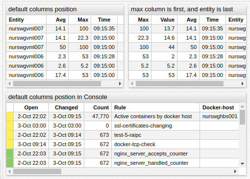

[column] settings provide the position setting to control the placement of the column regardless of the order in which [column] settings are defined in the widget. Possible values are first, middle and last.