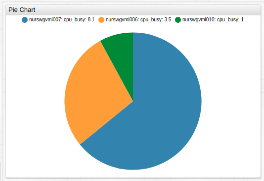
Pie Chart
Overview
The Pie Chart illustrates numerical proportions between the last series values and their total value.
[widget]
  type = pie

  [series]
    entity = nurswgvml0*
    metric = cpu_busy

Interactive Behavior
The Pie Chart implements interactive on-click behavior.
- Single click: Opens a dialog window with a Time Chart for the series.
- Double click: Configured with
selector-mode,on-series-double-click, andexpandsettings. The default behavior is to expand the sector.
Widget Settings
- The settings apply to the
[widget]section. - Common
[widget]settings are inherited.
| Name | Description | |
|---|---|---|
mode | Chart mode. Possible values: pie, ring.Default value: pie.Example: mode = ring | ↗ |
marker-format | Custom format applied to section labels. Possible values: pie, ring.Example: marker-format = entity : tags.app | ↗ |
on-series-double-click | Disable double click functionality in the widget. Example: on-series-double-click = '' | ↗ |
selector-mode | Control how series sectors react to click interaction. Possible values: highlight - Highlights the selected series segment.expand - Expands the selected series segment.Default value: expand.Example: selector-mode = highlight | ↗ |
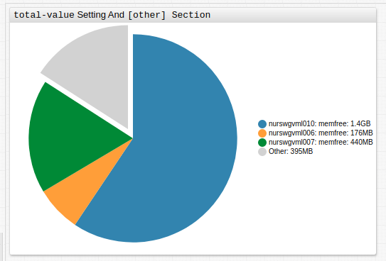
total-value | Specify total value. If no total-value setting is specified, total widget value is the sum of all series values.total-value can include hidden series.Possible values: Number, series('alias').Example: total-value = 100 | ↗ |
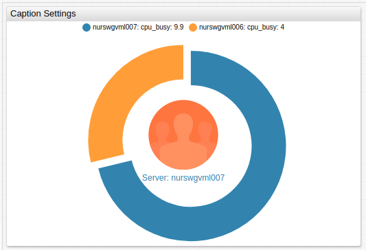
Icon and Caption Settings
- Apply icons and captions to the Pie Chart when
mode = ring.
| Name | Description | |
|---|---|---|
icon | Display .svg icon in Pie Chart ring.Path to custom icons must be set. Recommended icon directory is /opt/atsd/atsd/conf/portal/img/.Reference built-in icons by name, without directory path. See the Icon Reference Sheet for built-in icons. Underscores in built-in icon names can be substituted with dashes. Example: icon = public/img/svg/linear/user.svg | ↗ |
icon-alert-expression | Boolean expression to apply conditional CSS style to series icons. CSS style must be specified in the icon-alert-style setting.The value field refers to the series value.Example: icon-alert-expression = value('s1') > value('s2') | ↗ |
icon-alert-style | CSS style applied to the series shape if icon-alert-expression returns true.Example: icon-alert-style = return alert > 12000 ? 'fill: red' : 'fill:green'; | ↗ |
caption | Icon caption. Caption is updated upon series double click. Example: caption = Administrative Users | ↗ |
caption-style | Caption CSS style. Caption style is updated upon series double click. Example: caption-style = font-size: 64px; font-weight: bold; fill: steelblue; | ↗ |
min-font-size | Minimum caption font size. Font size does not scale below specified size. Example: min-font-size = 24 | ↗ |
max-font-size | Maximum caption font size. Font size does not scale above specified size. Example: max-font-size = 8 | ↗ |
Series Settings
- The settings apply to the
[series]section. - Common
[series]settings are inherited.
| Name | Description | |
|---|---|---|
expand | Expand series sector. Expand all series sectors when the setting is specified in the [widget] section.Possible value: false, true.Default value: false.Example: expand = true | ↗ |
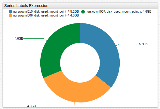
series-labels | Value label location. Set as an expression which changes the label type based on series value. Possible settings: inside, outside, connected, auto, none.Default value: none.Example: series-labels = inside | ↗ |
Other Settings
- The settings apply to the
[other]section. - Specifying the
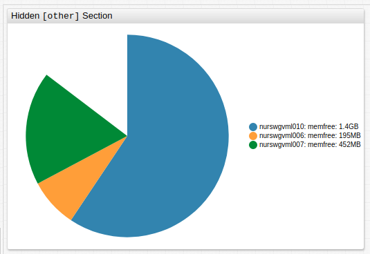
[other]section creates an additional segment not associated with any series which displays a value or spare capacity.
| Name | Description | |
|---|---|---|
display | Display the difference between total-value and sum of visible series values.Possible values: false, true.Default: true.Example: display = false | ↗ |
label | [other] section label.Default: Other.Example: label = Unmonitored Memory | ↗ |
tooltip | [other] section tooltip displayed upon mouseover.Default: Other.Example: tooltip = Unmonitored memory (HMC disabled) | ↗ |
color | [other] section color.Default: lightgray.Example: color = black | ↗ |
Examples
Ring Icons and Captions
Series Labels Expression
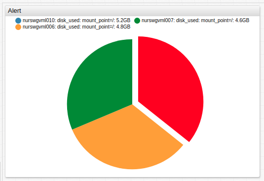
Alert
total-value Setting and [other] Section
Hidden [other] Section