Time Chart
Overview
The Time Chart displays series values at successive time intervals for one or more series. Data is loaded for a specified interval and updated as new samples are received.
[widget]
  type = chart

  [series]
    entity = nurswgvml007
    metric = cpu_busy

Widget Settings
- The settings apply to the
[widget]section. - Common
[widget]settings are inherited.
| Name | Description | |
|---|---|---|
context-height | Height of the Context Chart, which adjusts displayed timespan. Default value: 0 in the main window, 70 in the dialog window.Example: context-height = 50 | ↗ |
legend-value | Display last value for each series in the legend. Possible values: false, true.Default value: true.Example: legend-value = false | ↗ |
markers | Show series value markers. Toggle markers with the Markers option on the left axis mouseover menu. Possible values: false, true.Default value: true.Examples: markers = false | ↗ |
last-marker | Show last series value marker. Possible values: false, true.Default value: true.Example: last-marker = false | ↗ |
horizontal-grid | Show horizontal grid. Possible values: false, true.Default value: true.Example: horizontal-grid = false | ↗ |
vertical-grid | Show vertical grid. Possible values: false, true.Default value: true.Example: vertical-grid = false | ↗ |
step-line | Display step line instead of one which is linearly interpolated. Toggle step-line with the Step Line option on the left axis mouseover menu.Possible values: false, true.Default value: false.Example: step-line = true | ↗ |
auto-period | Assign aggregation period for series based on the chosen time interval. Possible values: false, true.Default value: true.Example: auto-period = false | ↗ |
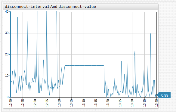
disconnect-interval | Maximum time gap between samples specified as the number of time units. If the gap between samples exceeds the specified interval, data points are not connected. Format: count time_unit.Example: disconnect-interval = 10 minute | ↗ |
disconnect-count | Average distance between time values in the series. If the gap between samples exceeds the defined value, data points are not connected. If disconnect-count = 1, the interval is equal to the mean interval between samples.Example: disconnect-count = 50 | ↗ |
disconnect-value | Works together with disconnect-interval or disconnect-count setting.Fills data gaps with a specific value. Use when ATSD does not collect null values or values below a threshold.Toggle display of disconnect-value with the Connect Values option on left axis mouseover menu.Example: disconnect-value = 0 | ↗ |
moving-average | When moving-average is enabled, the most recent aggregation period is based on sliding window ending with current time.When moving-average is disabled, all aggregate periods are set to start and end at regular times as established by calendar.Only supported together with server-aggregate = false setting.Possible values: false, true.Default value: false.Example: moving-average = true | ↗ |
negative-style | CSS style applied to negative values in column or column-stack mode.Example: negative-style = fill: red | ↗ |
current-period-style | CSS styles applied to current period values in column and column-stack mode.Example: current-period-style = stroke-dasharray: 5, 2, 1, 2 | ↗ |
forecast-style | CSS style applied to forecasts. Example: forecast-style = stroke: magenta; | ↗ |
Panels
| Name | Description | |
|---|---|---|
display-panels | Display widget controls in the top left and right corners. Possible values: false, true, hover.Default value: hover.Example: display-panels = true | ↗ |
expand-panels | Expand widget controls to show available selectors. Possible values: false, true, compact.Default value: compact.Example: expand-panels = true | ↗ |
periods | Custom aggregation periods in widget controls. Specified as the number of time units. Format: count time_unit.Example: periods = 20 minute, 4 hour | ↗ |
panels-timespan | Override timespan selectors displayed in the top left corner. | ↗ |
panels-statistics | Override statistical function selectors displayed in the top right corner. | ↗ |
panels-period | Override aggregation period selectors used by statistical functions in the top right corner. | ↗ |
Value Axis Settings
Also refer to [axis].
| Name | Description | |
|---|---|---|
auto-scale | Scale the visible portion of the value axis based on series values. Possible values: false, true.Default value: false.Example: auto-scale = true | ↗ |
ticks | Number of tick marks on the left axis. Default value: 5.Example: ticks = 10 | ↗ |
ticks-right | Number of tick marks on the right axis. Default value: 5.Example: ticks-right = 10 | ↗ |
Time Axis Settings
| Name | Description | |
|---|---|---|
ahead-timespan | Future interval displayed on the time axis, measured as percentage of timespan.Ignored if end-time setting is set manually.Possible values: 0 - 100%.Example: ahead-timespan = 80% | ↗ |
retain-timespan | Maintains a constant time interval during incremental widget update. Possible values: false, true.Default value: true.Example: retain-timespan = false | ↗ |
rotate-ticks | Rotate labels on the time axis by n degrees.Possible values: between 0 (horizontal) and 90 (vertical), or true (horizontal).Default value: 90 (vertical).Example: rotate-ticks = 0 | ↗ |
centralize-ticks | Center time and date markers over ticks. Possible values: false, true.Default value: false.Example: centralize-ticks = true | ↗ |
ticks-time | Tick marks on the time axis. Default value: 10.Example: ticks-time = 20 | ↗ |
display-date | Display Time Chart time period below the time axis. Possible values: false, true.Default value: false.Example: display-date = true | ↗ |
Axis Settings
- The settings apply to the
[axis]section.
| Name | Description | |
|---|---|---|
right | If true, apply settings to right axis, otherwise apply settings to left axis.Possible values: false, true.Default value: false. | ↗ |
title | Vertical text displayed along the axis. Example: title = CPU Utilization in %. | ↗ |
ticks | Number of tick marks on the axis. Default value: 5.Example: ticks = 10 | ↗ |
min | Axis minimum range. If loaded values exceed min value, axis range is adjusted to show loaded values.Example: min = 0 | ↗ |
max | Axis maximum range. If loaded values exceed max value, axis range is adjusted to show loaded values.Example: max = 100 | ↗ |
min-force | Axis forced minimum range. If loaded values exceed min-force, axis range is not adjusted to show loaded values.Example: min-force = 0 | ↗ |
max-force | Axis forced maximum range. If loaded values exceed max-force, axis range is not adjusted to show loaded values.max-force must be equal or exceed max.Example: max-force = 100 | ↗ |
delta | Difference between axis maximum and minimum. If loaded values exceed calculated delta, axis range is adjusted to show loaded values. Value must be greater, than 0. Example: delta = 50 | ↗ |
delta-percent | Number of percent in interval (0, 100) to adjust axis range. Minimum and maximum are calculated using the following formula: YMax/YMin = (1 + delta-percent/2*0.01)/(1 - delta-percent/2*0.01)If loaded values exceed calculated delta, axis range is adjusted to show loaded values. Example: delta-percent = 70 | ↗ |
Series Settings
- The settings apply to the
[series]section. - Common
[series]settings are inherited.
| Name | Description | |
|---|---|---|
mode | Chart mode, can be applied to both [widget] and [series] settings.Possible values: line - Connect series data points with a line.stack - Visually stack series.column - Display series as columns.range - Display range of series values.column-stack - Visually stack series in column-form. This setting must be set at the [widget] level or higher.Default value: line.Example: mode = column | ↗ |
load-future-data | Load future series values on scroll. Applies to type=forecast data.Possible values: false, true.Default value: false.Example: load-future-data = true | ↗ |
series-type | Grouping parameter for use in stack mode.Series of the same type are stacked (their values are summed). Set a unique value for each series to achieve fill effect without series stacking. Example: series-type = s1 | ↗ |
pointer-position | Location of final value pointer relative to series. Possible values: left, right, none.Default value: right.Example: pointer-position = left | ↗ |
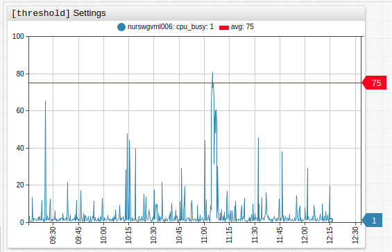
Threshold Settings
- The settings apply to the
[threshold]section. - Use
[threshold]settings to define series thresholds:- Load the series and include
display = falsesettings under[widget]settings. - Assign the series an
alias. - In the
[threshold]section, specify threshold value withvalue = value('alias')as seen in the ChartLab example below.
- Load the series and include
| Name | Description | |
|---|---|---|
label | Threshold legend label. Example: label = threshold | ↗ |
color | Threshold color. Example: color = red | ↗ |
value | Threshold value, set in JavaScript when the alert-expression for series uses the same format.Example: value = value('raw') * 2 | ↗ |
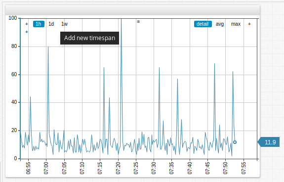
Time Chart Controls
- Modify selection interval and aggregation period on the fly.
- Add custom selection intervals and aggregation periods directly on the Time Chart.
- Apply various aggregations without reloading the portal.
- Change the chart mode:
line,column,range,stack. - View data in the appropriate format: hertz, joules, watts, bytes, percent, currency etc.
- Create custom metrics using custom formulas and aggregations.
- Modify alert rules directly in the portal.
- Instantly generate forecasts in the Time Chart.
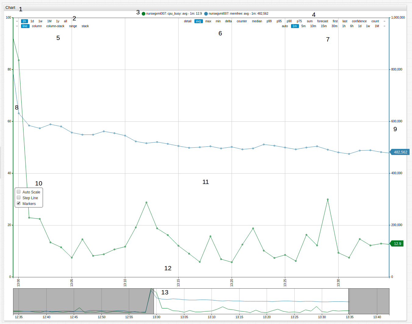
- Title: Click the title to expand the widget to fullscreen.
- Timespan: Select one of the available timespans from the menu.
- Series Icon: Toggle visibility of displayed series by clicking the icon to show or hide that series.
- Forecast Tools: Display forecast and confidence intervals for series.
- Mode: Select the display mode for the series.
- Aggregation: Select aggregation method for the series.
- Aggregation Period: Define the aggregation period for the series.
- Left Axis: Scale the left axis manually by dragging. Double click to reset values to default.
- Right Axis: Scale the right axis manually by dragging. Double click to reset values to default.
- Scale Options: Auto-scale the value of axes in the Time Chart. Display the series in
step-lineformat. Toggle value markers for the series. - Load All Data: Double click Time Chart surface to show all loaded data.
- Time Axis: Scale the time axis manually by dragging. Double click to reset values to default.
- Context Chart: Select a manual
timespanby dragging context chart endpoints.
Modifying Time Chart Controls
Add selection intervals and aggregation periods directly in Time Chart controls by double clicking the whitespace between the interval or period where the new interval is to be added. An interval or period roughly half way between the two values is added on each double click.
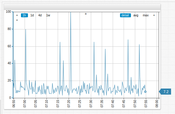
To add a four-day (4d) aggregation period, double click between the one-day (1d) and one-week (1w) aggregation periods in the controls of the Time Chart.
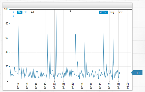
To remove selection intervals and aggregation periods, drag and drop the interval or period off the Time Chart controls. In the example below, the one-week (1w) aggregation period is removed.
Examples
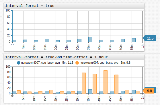
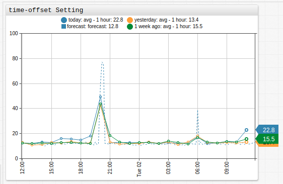
time-offset Setting
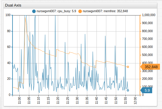
Dual Axis
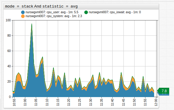
Stack Average
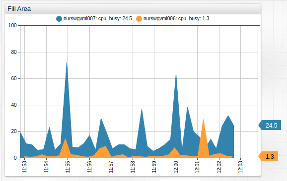
Fill Area
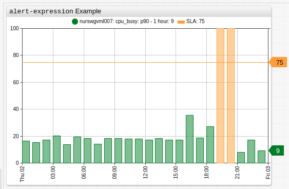
alert-expression Example
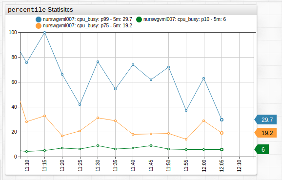
Percentile
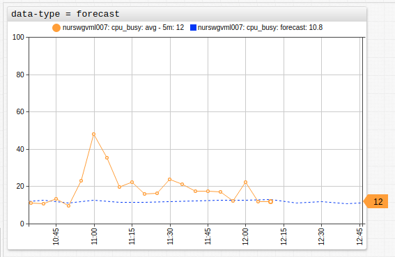
Forecast
Gaps
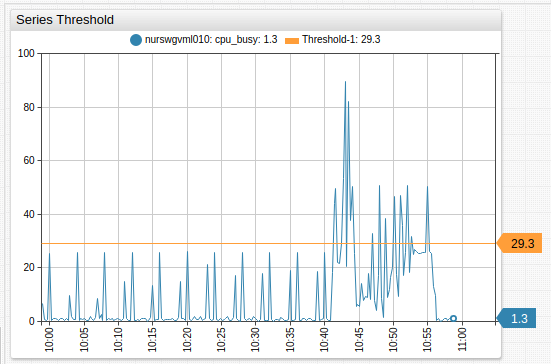
[threshold] Settings
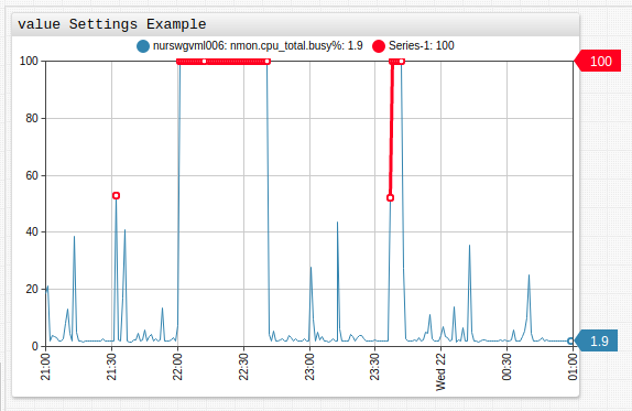
value Settings Example
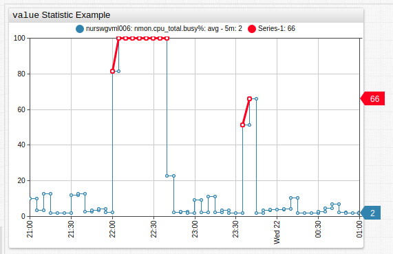
value Statistic Example
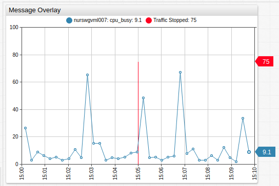
Message Overlay
Insert messages into the database as series, using series tags to encode message text. Add messages to a Time Chart with mode=column setting.
Elapsed Time
Overlay multiple intervals on the time axis with interval formatting.