Text Widget
Overview
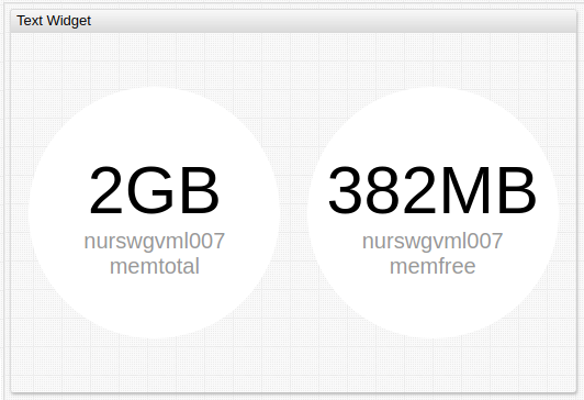
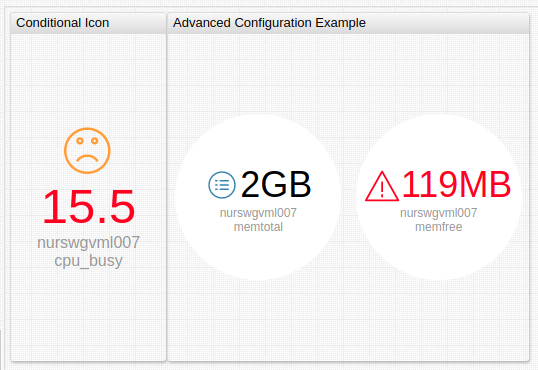
The Text Widget displays last series value with an optional icon. Each series in the widget is rendered separately.
The widget can be used to emphasize important metrics.
[widget]
  type = text
  entity = nurswgvml007

  [series]
    metric = memtotal
  [series]
    metric = memfree

When the values are hidden, the widget can present many series in a compact view.
Widget Settings
- The settings apply to the
[widget]section. - Common
[widget]settings are inherited.
| Name | Description | |
|---|---|---|
circle | Display series values inside a circle. Possible values: false, true.Default value: false.Example: circle = true | ↗ |
min-font-size | Minimum font size for labels, in pixels. Example: min-font-size = 20 | ↗ |
max-font-size | Maximum font size for labels, in pixels. Example: max-font-size = 60 | ↗ |
on-series-click | Behavior upon series label click. See example configuration for possible values. Example: on-series-click = callDialog({ type:'page', url: 'https://axibase.com' }) | ↗ |
icon-size | Resize icon to fill all available space. If icon-size is not set, icon is scaled proportionally to font height.Control font size with min-font-size and max-font-size.Possible value: auto.Example: icon-size = auto | ↗ |
Series Settings
- The settings apply to the
[series]section. - Common
[series]settings are inherited.
| Name | Description | |
|---|---|---|
icon | Display .svg icon in the Text Widget.Path to custom icons must be defined. Default ATSD icon directory is /opt/atsd/atsd/conf/portal/img/.Reference built-in icons by name, without directory path. See the Icon Reference Sheet for built-in icons. Underscore ( _ ) can be replaced with dash (-).The path to icons on AxibaseServer is /CSS/images/embedded/<name>.svg.Custom icon must be placed in /atsd-hostname/config/workspace/svg and referenced with the path /workspace/svg/image-name.svg.Example: icon = user.svg | ↗ |
icon-position | Icon position relative to series value. Possible values: left, right, top, bottom.Default value: top.Example: icon-position = bottom | ↗ |
icon-color | Icon color. Possible values: color name. Example: icon-color = orange | ↗ |
icon-alert-style | CSS style applied to icon when alert-expression is true.Example: icon-alert-style = fill: red; | ↗ |
Examples
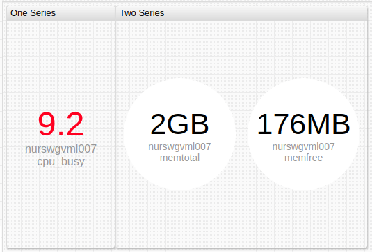
Multiple Series
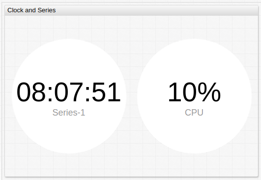
Clock and Series
Advanced Configuration Example
Icon Alert
Alert Grid
To hide both captions and values, add the following custom styles o the portal.
[configuration]
  script = $('<style>.axi-text-widget-value {color: transparent; font-size: 1px !important} .axi-text-widget-caption {display: none} </style>').appendTo('head')
Apply
max-font-sizeto limit the size of the circles.Set common background color to all series using the
stylesetting.Apply
alert-expressionto change the background color based on last value.