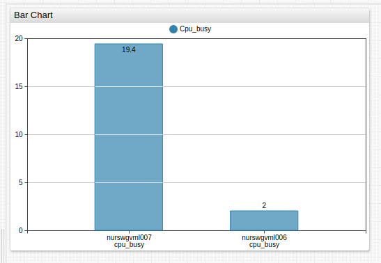
Bar Chart
Overview
The Bar Chart displays last series values as horizontal or vertical bars.
[widget]
  type = bar
  metric = cpu_busy

  [column]
    [series]
      entity = nurswgvml007
  [column]
    [series]
      entity = nurswgvml006

Widget Settings
- The settings apply to the
[widget]section. - Common
[widget]settings are inherited.
| Name | Description | |
|---|---|---|
horizontal | Display bars horizontally. Possible values: false, true.Default value: false.Example: horizontal = true | ↗ |
stack | Disable series grouping to display each series in a separate column. Possible values: false, true.Default value: true.Example: stack = false | ↗ |
group | Grouping keys to apply the same color to series in the same group. Default value: metric.Examples:
| ↗ |
display-values | Show bar values. If mode = stack, displayed total represents sum of all included series.Possible values: false, true.Default value: true.Example: display-values = false | ↗ |
rotate-ticks | Rotate labels on the x axis by n degrees.Possible values: true (vertical), and 0 (horizontal) to 90 (vertical).Default value: 0.Examples:
| ↗ |
sort | Sort bars by value in ascending (ASC) or descending (DESC) order.If the column contains multiple metrics, specify the name of the metric value to use to sort bars. When mode = stack, bars are sorted by total grouped value.If a column has multiple series, keyword in sort setting represents the sum of series values.Examples:
| ↗ |
hide-empty-columns | Hide columns with no data. Possible values: false, true.Default value: false.Example: hide-empty-columns = true | ↗ |
Column Settings
- The settings apply to the
[column]section.
| Name | Description | |
|---|---|---|
column-alert-expression | Boolean expression to apply conditional style to bars. The CSS style must be specified in the column-alert-style setting.The value field contains the total of all series in the given bar.Example: column-alert-expression = value > 10 | ↗ |
column-alert-style | CSS style applied to the bar rectangle if column-alert-expression is true.Example: column-alert-style = fill: red; stroke: red | ↗ |
column-label-format | Column label pattern containing text and placeholders. Supported placeholders: entity, metric, tagName, tagValue, tags.{tag-name}, statistics, period.Default value: entity: metric: tagName=tagValue: statistics - period.Example: column-label-format = tags.mount_point | ↗ |
multiple-column | Applies to wildcard configurations. If true, series with the same entity and tags are grouped in the same column. This applies to derived series which are placed in the same column alongside the underlying series.Possible settings: false, true.Default value: false.Example: multiple-column = true | ↗ |
Series Settings
- The settings apply to the
[series]section.
| Name | Description | |
|---|---|---|
entity-label | Override grouped series legend when group = entity.Example: entity-label = srv007 | ↗ |
metric-label | Override grouped series legend when group = metric.Example: metric-label = CPU Busy, % | ↗ |
Examples
Horizontal Bar Chart

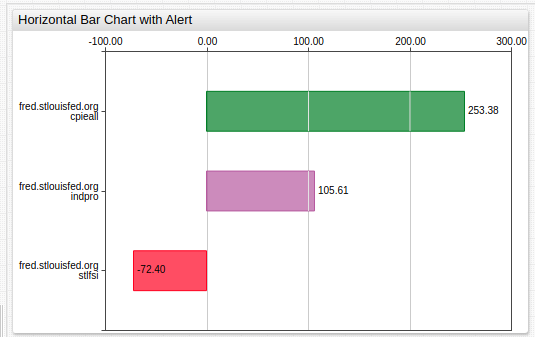
Horizontal Alert
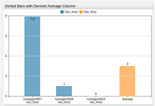
Sorted Bars with Derived Average Column