Box Chart
Overview
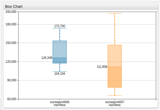
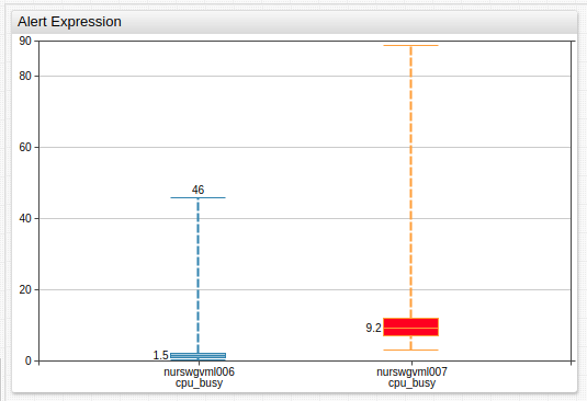
The Box Chart displays a distribution of observed values over a user-defined time interval. The chart shows the minimum and maximum values, the median, and a customizable percentile range.
[widget]
  type = box
  metric = memfree

  [series]
    entity = nurswgvml00*

Widget Settings
- The settings apply to the
[widget]section. - Common
[widget]settings are inherited.
| Name | Description | |
|---|---|---|
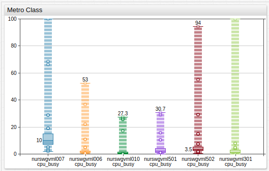
class | Display percentile markers as circles on a dotted line, as common on subway maps. Possible values: metro.Example: class = metro | ↗ |
rotate-ticks | Rotate labels on the time axis by n degrees.Possible values: between 0 (horizontal) and 90 (vertical) or true (vertical).Default value: 0. (vertical).Example: rotate-ticks = 90 | ↗ |
Series Settings
- The settings apply to the
[series]section. - Common
[series]settings are inherited.
| Name | Description | |
|---|---|---|
percentiles | Minimum and maximum percentiles for the shaded box area. Possible values: 0% to 100%.Default value: 25%/75%.Example: percentiles = 10%/90% | ↗ |
percentile-markers | Circular percentile marker position. Possible values: all, none, top, bottom.Default value: none.Example: percentile-markers = all | ↗ |
Examples
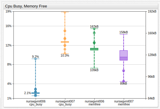
Percentile Markers
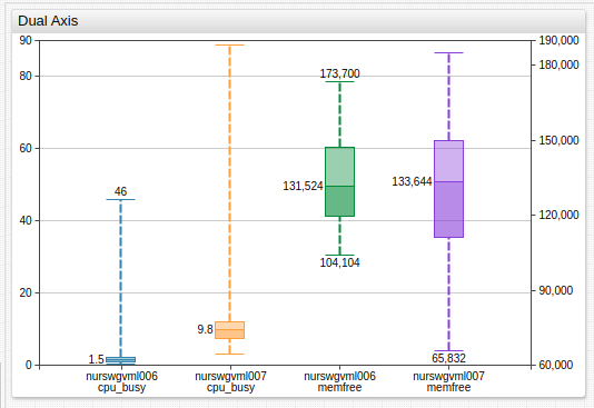
Dual Axis
Alert Expression
metro Class