Histogram Chart
Overview
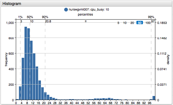
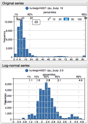
The Histogram Chart shows the distribution of samples recorded within the specified timespan using percentiles, frequencies, and density.
[widget]
  type = histogram

  top-axis = percentiles
  right-axis = density

  [series]
    entity = nurswgvml007
    metric = cpu_busy

Widget Settings
- The settings apply to the
[widget]section. - Common
[widget]settings are inherited.
| Name | Description | |
|---|---|---|
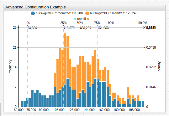
mode | Add frequencies from multiple series. Possible values: stack, none.Example: mode = stack | ↗ |
bar-count | Number of bars in which to group loaded samples. Default value: 50.Example: bar-count = 20 | ↗ |
Axis Settings
| Name | Description | |
|---|---|---|
left-axis | Value statistics displayed on the left axis. Possible values: frequency - The height of each bar is equal to the number of samples in the bar range.density - The height of each bar is equal to the number of samples in the bar range divided by the total number of samples. The sum of all densities is 1.none - No scaling applied.Default value: frequency.Example: left-axis = frequency | ↗ |
right-axis | Value statistics displayed on the right axis. Same as left axis. Default value: none.Example: right-axis = density | ↗ |
top-axis | Value statistics displayed on the top axis. Possible values: none, percentiles, values.Default value: none.Example: top-axis = percentiles | ↗ |
bottom-axis | Value statistics displayed on the bottom axis. Possible values: none, percentiles, values.Default value: values.Example: bottom-axis = percentiles | ↗ |
rotate-ticks | Rotate labels on the bottom axis (typically values axis) by n degrees.Possible values: 0 (horizontal) and 90 (vertical).Default value: 0.Example: rotate-ticks = 90 | ↗ |
range-offset | Offset applied to the bottom axis, specified in pixels. Default value: 0.Example: range-offset = 100 | ↗ |
percentiles | Percentile numbers to calculate and displayed on the top or bottom axis. Markers are hidden if the space to display the value is missing. Possible values: list of comma-separated numbers (0,100].Example: percentiles = 50,75,90,95,97,99 | ↗ |
vertical-grid | Display a vertical line corresponding to each percentile or bar range. Possible values: none, percentiles, values.Default value: percentiles.Example: vertical-grid = percentiles | ↗ |
horizontal-grid | Display a horizontal line corresponding to each value on the right or left axis. Possible values: none, density, frequency.Default value: frequency.Example: horizontal-grid = frequency | ↗ |
Examples
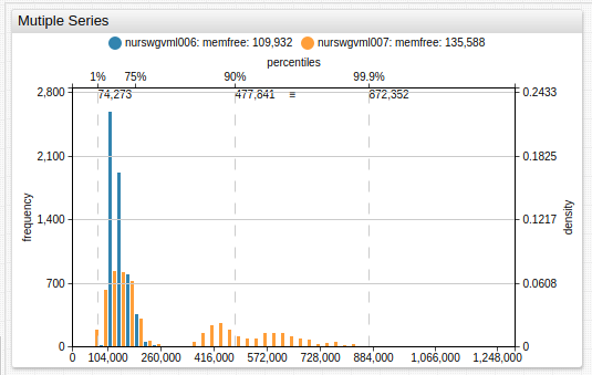
Multiple Series
Stacked Frequencies
Log-Normal Distribution
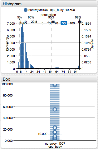
Histogram and Box Charts