Gauge Chart
Overview
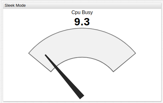
The Gauge Chart displays last series value on a circle with colored sectors and a dial.
If the widget contains multiple series, the gauge displays the total value of included series.
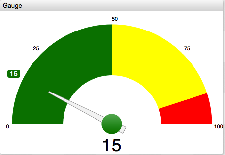
[widget]
type = gauge
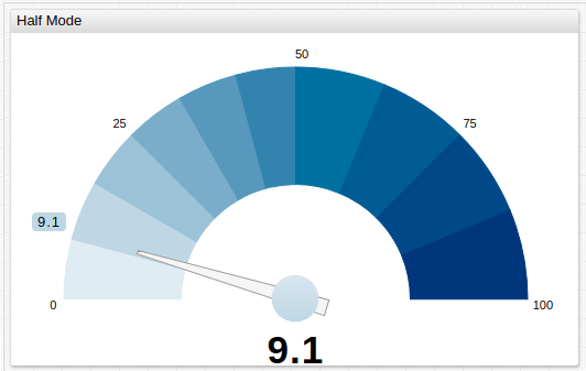
mode = half
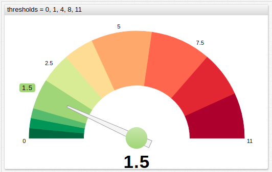
thresholds = 0, 50, 90, 100
colors = green, yellow, red
[series]
entity = nurswgvml007
metric = cpu_busy

Widget Settings
- The settings apply to the
[widget]section. - Common
[widget]settings are inherited.
| Name | Description | |
|---|---|---|
mode | Gauge type. The visible sector is set to 240 degrees in default mode, and to 180 degrees in other modes.Possible values: default, sleek, half.Default value: default.Example: mode = sleek | ↗ |
thresholds | Numeric thresholds to split the circle into multiple sectors, each assigned a different color. The thresholds can be static or calculated. The number of thresholds must be 1 greater then the number of colors.Example: thresholds = 0, 50, 90, 100 | ↗ |
colors | Comma separated list of color names or hex codes, assigned to threshold sectors. The number must be 1 fewer than the number of thresholds.Example: colors = green, yellow, redRecommended color palette tools: colorhexa, material.io. | ↗ |
color-range | Color palette applied to threshold sectors. Possible values: red, blue, black.Example: color-range = red | ↗ |
gradient-count | Number of gradient sub-sectors within each threshold sector. Example: gradient-count = 3 | ↗ |
gradient-intensity | Gradient contrast. Possible values: [-100%,100%] / [-100%,100%].Example: gradient-intensity = -20% / 50% | ↗ |
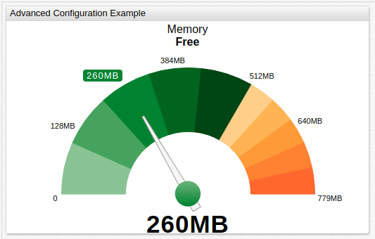
caption | Text displayed on top of the gauge. HTML markup is supported. Example: caption = Operating System | ↗ |
caption-style | Caption CSS style. Example: caption-style = font-size: 64px | ↗ |
ticks | Number of major ticks placed on the circle arc. Default value: 5.Example: ticks = 2 | ↗ |
minor-ticks | Ratio of minor ticks per major tick. Supported only in default mode.Default value: 0.Example: minor-ticks = 4 | ↗ |
display-ticks | Show numeric values on major ticks. Possible values: false, true.Default value: true.Example: display-ticks = true | ↗ |
counter-position | Counter position. The counter displays series value. Possible values: top, bottom, none.Default value: depends on mode.Example: counter-position = none | ↗ |
display-tip | Show colored rectangle containing series value on the arch or at the tip of the value arrow. Possible values: false, true.Default value: true.Example: display-tip = false | ↗ |
format-tip | Apply formatting to the series value displayed on the arch or at the tip of the value arrow. Example: format-tip = kilobyte | ↗ |
format-axis | Apply formatting to tick values. Example: format-axis = fixed(2) | ↗ |
format-counter | Apply formatting to counter value. Example: format-counter = numeric | ↗ |
ring-width | Gauge ring width. Percent of total possible width. Possible values: [0%, 100%].Example: ring-width = 20% | ↗ |
border-width | Offset between gauge ring and container. Percent of total possible radius. Possible values: [0%, 100%].Example: border-width = 20% | ↗ |
pin-radius | Pin circle radius. Percent of total possible radius. Possible values: [0%, 100%].Example: pin-radius = 20% | ↗ |
arrow-length | Length of gauge arrow. Percent of total possible length. Possible values: [0%, 100%].Example: arrow-length = 30% | ↗ |
Examples
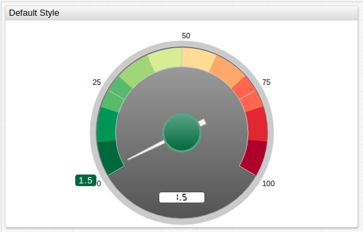
Default Style
half Mode
sleek Mode
Thresholds
Calculated Thresholds