Alert Table
Overview
The Alert Table displays a continuously updated list of open alerts or messages, filtered by entity, rule/metric name, and minimum severity.
The rows in the table are color-coded based on the severity of the underlying record.
[widget]
type = console
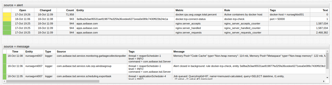
source = alert
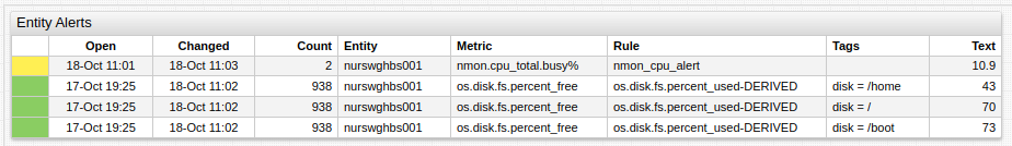
entity = nurswgvml007

Data Source
Widget Settings
- The settings apply to the
[widget]section. - Common
[widget]settings are inherited. - Common Table
[widget]settings are inherited.
Filters
| Name | Description | |
|---|---|---|
source | Source of records. Possible values: alert, message.Default value: alert.Example: source = message | ↗ |
entity | Entity name or pattern. Multiple values can be specified. Example: entity = nurswgvml007 | ↗ |
rule | Rule name. Multiple values can be specified. Example: rule = accepts_counter | ↗ |
metric | Metric name. Multiple values can be specified. Example: metric = cpu_busy | ↗ |
min-severity | Minimum severity level. Possible values: 0-7 or UNDEFINED - FATAL.Example: min-severity = ERROR | ↗ |
limit | Maximum number of returned records. Default: 1000.Example: limit = 100 | ↗ |
severity | Severity codes or names to filter records. Multiple values can be specified. Possible values: 0-7 or UNDEFINED - FATAL.Example: severity = 6 | ↗ |
message-expression | Include messages that match a filter expression. The expression can include fields: type, source, tags, tags.{name}, message,severity.Supported wildcards: * and ?.Example: message-expression = message LIKE 'Starting*'. | ↗ |
primary-key | Filter rows by specific field. Possible values: depend on source• message • alert Default: id.Example: primary-key = type | ↗ |
Date Filter
Date interval filters such as timespan are applied to the openDate field in alerts and to the date field in messages.
Style
| Name | Description | |
|---|---|---|
class | Display the table as console with black background. Possible values: terminal.Example: class = terminal | ↗ |
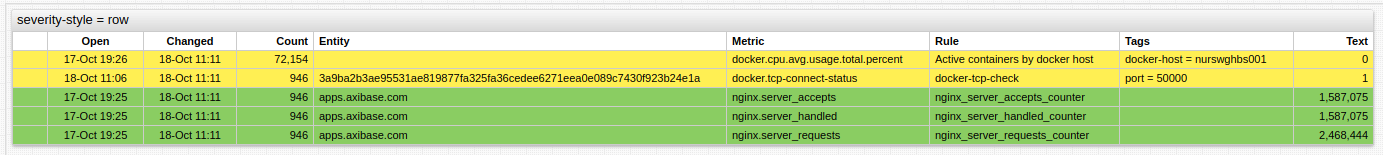
severity-style | Apply severity color to a single column or entire row. Possible settings: row, column.Example: severity-style = row | ↗ |
row-style | CSS style applied to the entire row. Can be specified as text or a JavaScript expression. Can be used to filter records. Example: row-style = if (value <= 100) return 'display: none' | ↗ |
on-click | Built-in or custom function triggered on click. Example: on-click = filter() | ↗ |
new-row-color | Highlight left border of rows, which have date or lastEventDate greater than now - update-interval, with specified color.Possible value: color name or hex code. Recommended color picking tools: colorhexa, material.io.Example: new-row-color = red | ↗ |
Column Settings
- The settings apply to the
[column]section. - Common Table
[column]settings are inherited.
| Name | Description | |
|---|---|---|
collapsible | If true, add controller to collapse or expand column cell and Collapse All button to widget header.Possible values: false, true.Default value: false.Example: collapsible = true | ↗ |
summary-text | JavaScript expression returning caption used for cell if collapsible = true.Default value: Details.Example: summary-text = row.date | ↗ |
Default Columns
The list of default columns depends on the source setting:
messagecolumns:Severity,Time,Entity,Type,Source,Tags,Messagealertcolumns:Severity,Open,Changed,Count,Entity,Rule,Metric,Tags,Text
To display tags as separate columns, set expand-tags setting to true.
Examples
Difference Sources
Audio Alert
Row Severity